«Back ·
Hummingbird FONT Download


 Designer:
 Laura Worthington
Publisher: Laura Worthington
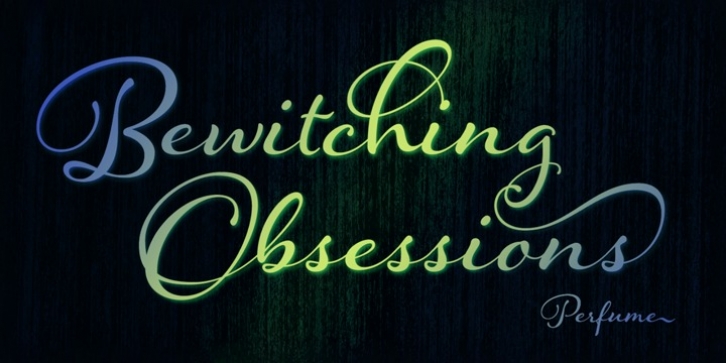
is reminiscent of old-fashioned cursive penmanship, the sort learned by endless repetition and found in treasured letters bundled together by silken ribbons or in worn leather-bound ledgers. The aim, across the past few centuries, was a graceful, yet disciplined uniformity. But to the discerning eye, those hours of painstakingly practiced elegant scripts were still, at their essence, thoroughly human, filled as they were with unintentional variations in pressure, contrast, and fluidity. My typeface,
Hummingbird, uses technical sophistication to bring us a typeface that is lovely, sensual, airy, personal, and, in its sensitively wrought irregularities, as innately and intimately human as the writer’s hand and pen.
CONTEXTUAL ALTERNATES
A unique feature of
Hummingbird is its impressive number of these subtle variations, known as contextual alternates. If you’re not a typographer, or familiar with the term, consider this: Type a letter, and its appearance will vary depending on its placement and adjacent letters. Will it end the sentence and require a finishing out-stroke, a little flourish that says, “This word has played its part.”? Will it be a “b” sandwiched between a “g” and an “i”? The contextual alternate avoids the rote rigidity of digital production and, instead, turns to the human hand and habit for its answer. A long upsweep from the base of the “g” transforms into the curving ascender of the “b,” and then a tender little curve connects the end of the “b” to the beginning of the following “i.” Some letters have different beginning forms, all have different ending forms, and with double letter occurrences, one of the letters will use the alternate. Some letters are semi-connected. The alternates bring a flowing randomness to the typeface, tempered by their reference to a more natural handwritten appearance, rather than acting as a sort of decorative embellishment.
Hummingbird has 214 contextual alternates.
The font also has 266 swashes that include an entire set of decorated uppercase letters that add personality, emphasis, and beauty.
OFF OR ON?
When should you turn off contextual alternates? As a designer, you’ll have a feel for this. Depending on your readership, some may not notice the subtleties, yet their visceral response may differ when they view your work. Without contextual alternates, the typeface looks a bit more structured and consistent, less random and natural; it will still be more approachable than a traditional formal script, yet retaining its own airy charm. Contextual alternates do not appear as a web font, but they function by default for print work in software like InDesign, or for logo or other illustrative work in Photoshop, Illustrator, and others. Check your software; your mileage may vary.
PROCESS
My process is intuitive and iterative. I start with an idea that evolves, taking detours and different directions, moving forward and back until I have something that is quite different from my initial concept. Think of the fine artist who begins with a blank canvas that becomes layer after layer of paint. Walk into her studio each day and the work on the canvas changes, sometimes dramatically, telling a different story with each layer. Despite the precision required of my finished fonts, I often feel my way there in my sketches using brushes and pens, not sure where the journey will end. Most of my work is done in studio, but I’ll also do the earlier conceptual and sketchbook work out in the country. I will gesturally draw the same letters over and over again, so many times that I can create each one based on muscle memory. Pencil is great for this; it’s easy to do huge, gestural swoops.
Two stories came together as I worked on
Hummingbird. First, I’d used gel pens to decorate a cake and loved the sensuality, the fluidity and the syrupy gooeyness of it. I was attracted to the tactility, the rhythmic ebb and flow of a substance that was like thick water—I yearned to immerse my hands in it. It differed strikingly from much of my work which is more sharp and angular. I found that I couldn’t mimic the softness and fluidity using only a brush and pen. I also knew that ultimately this sense of something free-flowing would need to be captured and confined within the constraints of square pixels. I did a great deal of experimentation, transforming my feeling, my sense of tactility into something digital. Because this was so flowing rather than angular, I needed to use that repetitive/muscle memory technique even more than I usually do. Typically, I’m much more deliberate in my process.
The second story entwined here was that I wanted to play with something a bit more relaxed than my body of work. As I sketched, I watched hummingbirds flit about the plants I’d cultivated specifically to attract them. I noted how tiny they were and then looked at how small the x-height of my typeface is compared to much of the lettering we see. The birds zoomed among the towering trees and I saw that polarity reflected in the typeface: gracious large letters contrasted with small, delicate lowercase letters, giving the font more style and impact than something more structured. The resemblance between nature and my lettering was both unintentional and authentic.
I strove for a sense of openness, allowing more space between letters, avoiding density and high contrast. I aimed for a finished typeface that would be delicate, airy, charming: a modern face with a twist of nostalgia.
TECHNICAL INFORMATION
Typically a display and titling font,
Hummingbird supplies a full User’s Guide with your download, explaining use of contextual alternates, alternates, swashes, and how to access Open Type features.


 Hummingbird is reminiscent of old-fashioned cursive penmanship, the sort learned by endless repetition and found in treasured letters bundled together by silken ribbons or in worn leather-bound ledgers. The aim, across the past few centuries, was a graceful, yet disciplined uniformity. But to the discerning eye, those hours of painstakingly practiced elegant scripts were still, at their essence, thoroughly human, filled as they were with unintentional variations in pressure, contrast, and fluidity. My typeface, Hummingbird, uses technical sophistication to bring us a typeface that is lovely, sensual, airy, personal, and, in its sensitively wrought irregularities, as innately and intimately human as the writer’s hand and pen.
