«Back ·
Pensum Pro FONT Download


 Designer:
 Nils Thomsen
Publisher: TypeMates
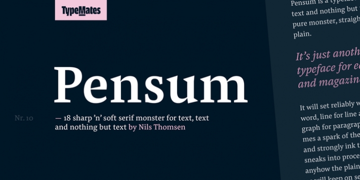
is a typeface for text, text and nothing but text. A pure monster, straight and plain. It will set reliably word for word, line for line and paragraph for paragraph, sometimes a spark of the sexy, curvy and strongly ink trapped italic sneaks into proceedings but anyhow the plain workhorse will keep on setting text. Deep inside some sharp details are hidden unlike some brushy and smooth shapes to be revealed in large sizes.
But seriously …
Pensum Pro comes along with nine weights from thin to black plus italics. The strong serifs combined with the low contrast makes it excellent for long reading text for example in magazines and books. The extreme thin and fragile styles can give a stylish and fashionable look, while the strong black weights are great for the rough nature of mountain sports.
Pensum Pro counts around 1050 glyphs including lots of OpenType Features to full fill every typographical need. Most important for lovers of book typography, the small-caps are slightly wider than the caps. You will find punctuation in case- and small cap-sensitive variations.
The Adobe Latin 3 encoding is a TypeMates standard and gives a wide range of flexibility for Latin language support.
Pensum Pro is broad-nib based and inspired by some handwritten brush exercises at Peter Verheuls class during (the) Type and Media course 2009 in The Hague. Nils was always looking to find the right balance between some extravagant details in contrast to a simple and straight forward face.
The caps are a special experiment. Modern proportions (optical same width) are mixed with the proportions of the old Capitalis Romanis (varying width) … This give them a delicate old fashioned look without loosing it’s economy.
To prevent clashes from descenders and accents the caps are slightly lower towards the ascenders. Moreover the lowercase demonstrate a large x-hight and are balanced between extreme smooth to super sharp shapes.
The excellently and nicely balanced contrast helps Pensum to work great in very small sizes, because of the ink-trap effect. On the other hand this contrast looks incorruptible in large headlines and italic quotes!
Of course, it’s a text-monster created for text, text and nothing but text. So unleash the beast and start typesetting some serious text or distinctive headline!
Any questions? … Say hej@typemates.com


 Pensum Pro is a typeface for text, text and nothing but text. A pure monster, straight and plain. It will set reliably word for word, line for line and paragraph for paragraph, sometimes a spark of the sexy, curvy and strongly ink trapped italic sneaks into proceedings but anyhow the plain workhorse will keep on setting text. Deep inside some sharp details are hidden unlike some brushy and smooth shapes to be revealed in large sizes.
