«Back ·
Mestre FONT Download


 Designer:
 Pedro Arilla
Publisher: Tipotecture
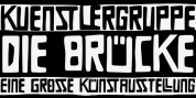
is a German & Dutch inspired geometric sans-serif designed by Pedro Arilla for Tipotecture. Its solid and formal shapes are embedded with a discreet humanist flair resulting on a very versatile contemporary hybrid and a highly functional and flexible font for many of today’s editorial and corporate requirements.
With its rational forms and its large x-height
Mestre is perfect for long texts in small sizes allowing a comfortable reading. Its open forms, moderate & balanced proportions, neutral appearance and solid structure grant a high legibility on paper and on screens.
With its extensive 8 weights and corresponding true italics, more than 900 glyphs per font, extended character set to support Central and Eastern European as well as Western European languages and various OpenType features (small caps, case-sensitive forms, lining, tabular & old-style figures, scientific superior/inferior figures, fractions, a set of arrows, etcetera) it is meant to build visual hierarchies of any detail and complexity in editorial design or deliver the best performance for branding purposes.
Mestre is a great choice for modern, contemporary and professional typography.