«Back ·
Lust FONT Download


 Designer:
 Neil Summerour
Publisher: Positype
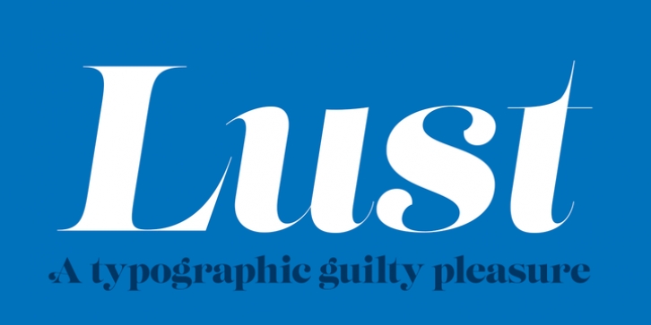
is my overly indulgent attempt to infuse wanton sensuality in a typeface. I wanted to create something that was over the top but veered away from my loose “sushi” scripts, Fugu and Nori, yet was altogether reliable, without the rigidity akin to my Aaux Next series -- but it had to be, well, a little sexy. The solution was to create a curvy serif. A serif would be a different endeavor for me since I consciously choose not to do many serifs -- because there are so many wonderful options already! Because of this, my approach (and design) had to be different. Here’s how I broke down what I felt it needed to have under the covers to create this “lusty” typeface: Lots of contrast, almost demure, coy contrast mixed with the flowing curves of a woman’s body, incomplete, almost teasing ball terminals, and serifs that went on forever-- so sharp they would draw blood if you touched them.
The result yielded a rather diverse typographic gene pool: a little Scotch Modern, a little Didone and Didot, a dominant dose of Caslon, and a pinch of Baskerville-- all wrapped up in the leggy body of a Brazilian supermodel. A confident, self-reliant typeface that shows just enough to keep everyone staring and leave them wanting more. With this design done, I moved to make it even more desirable and created the display variants with double the contrast!
WARNING! I cannot stress this enough. Please know what you are getting into with this typeface. Like a supermodel, it can't be squeezed into every situation. It needs room and size to breathe. The regular weights can support 36-point or higher settings, whereas the display weights shine above 72-point (preferably 100-point).
Lust is packed with alternates to play with-- enough to turn you on and satisfy. Utilizing the OpenType features (and Glyph palette) wisely will have you weaving through endless variations of Stylistic, Contextual, Titling, Historical and Swash alternates-- and the Italic styles feature a Contextual system that allows you to switch seamlessly between Didone and Scotch traits in order to better complement the upright variants.


 Lust is my overly indulgent attempt to infuse wanton sensuality in a typeface. I wanted to create something that was over the top but veered away from my loose “sushi” scripts, Fugu and Nori, yet was altogether reliable, without the rigidity akin to my Aaux Next series -- but it had to be, well, a little sexy. The solution was to create a curvy serif. A serif would be a different endeavor for me since I consciously choose not to do many serifs -- because there are so many wonderful options already! Because of this, my approach (and design) had to be different. Here’s how I broke down what I felt it needed to have under the covers to create this “lusty” typeface: Lots of contrast, almost demure, coy contrast mixed with the flowing curves of a woman’s body, incomplete, almost teasing ball terminals, and serifs that went on forever-- so sharp they would draw blood if you touched them.
