«Back ·
Parisine Std FONT Download


 Designer:
 Jean François Porchez
Publisher: Typofonderie
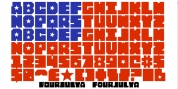
A workhorse & economical sanserif in 16 series
Parisine is a workhorse and economical sanserif, highly legible, who can be considered as a more human alternative to the industrial-mechanical Din typeface family. More human, but not fancy: No strange “swashy” f, or cursive v, w etc. on the italics, to keep certain expected regularity, important for information design, signages, and any subjects where legibility, sobriety came first.
Parisine is organised in various subsets, from the original family Parisine (4 compatible fonts), Parisine Gris featuring lighter versions of the usual Regular and Bold (4 compatible fonts), Parisine Claire featuring extra light weights (4 compatible fonts), to Parisine Sombre with his darker and extremly black weights as we can seen in Frutiger Black or Antique Olive Nord (4 compatible fonts). Each member of the family is composed of more than 720 glyphs and feature thousand of kerning pairs. Many years of adjustments were necessary to refine this complex family.
Initially, Parisine was designed by Jean François Porchez in 1996 for Ratp to solely fulfil the unique needs of signage legibility. Parisine remain the official corporate typeface of the public transport in Paris, the worldwide capital for tourism, and now integral part of the French touch.
Directly related, Parisine Office was initially created for Ratp’s internal and external communication, Parisine Office is also available at Typofonderie too. Not connected with Ratp and public transports, Parisine Plus was created as an informal version of Parisine. Notable use of this typeface is the identity, signage of the Musée du Quai Branly in Paris.