«Back ·
Opal FONT Download


 Designer:
 Hannes von Döhren
Publisher: Linotype
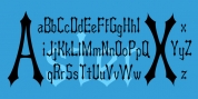
Pro is a text family designed by Hannes von Döhren in 2008. It gives every text a noble character. The typeface has long ascenders that clearly rise above the capital letters and a low x-height.
Opal’s letters sport inktraps at stroke junctions, which on one hand create a cutout feeling and on the other hand strengthens the image in larger point sizes. In total, the letterforms have clear emphasis on their verticals and horizontals; they do not fear the weight on their curves. In addition to the Italic and Bold, the
Opal type family includes a Script face, whose letterforms include connections, similar to handwriting. On top of that, the typeface possesses swash letters for italic and script, small caps, many ligatures and borders & ornaments.
With a little bit of care, designers will be able to create the finest of traditional, elegant work with this family.