«Back ·
Geometron Pro Angular FONT Download


 Designer:
 Marius Mitran
Publisher: Marius Mitran
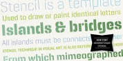
Geometron has its origin in a custom typeface that I was commissioned to design for an architectural project. The concept was a “back to basics”, minimalist typeface constructed mainly with straight lines and circles or circular arcs, but without departing from the classical style of Roman & Greek lettering.
Notable requirements were: an extensive character set needed for multi-language documentation, as well as a full collection of symbols and alternate glyph forms (e.g. superiors & inferiors) for scientific use. Special care was taken to obviate the almost identical similarities that were prone to appear between letters like uppercase “i” and lowercase “L” or between Latin and Greek letters such as “a” and “alpha”. This was also a prerequisite for scientific notation where ambiguity is not acceptable.
All in all, the font would have to blend a modern design with a wealth of functional features. Consequently, all of these were made possible by choosing the OpenType format for development, resulting in a comprehensive and feature-rich font family specifically targeted for use in high-end design/typesetting applications.