«Back ·
Preta FONT Download


 Designer:
 Maximiliano Sproviero
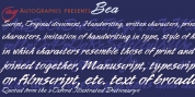
Publisher: Lián Types
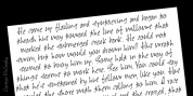
, portuguese for a very pure kind of black, has its name very related to its concept: I wanted to make the fattest/darkest script ever.
People who follow my work may notice its forms are very related to works of my past (1) but this time the challenge was to be very cautious with the white spaces between letters. Not only I followed some rules and ductus of the copperplate style of calligraphy but also I took a lot of inspiration in posters of the early Art Nouveau (specially in Alfred Roller of the Vienna Secession) where letters forms looked like black squares if not looked from a close distance. With
Preta, I wanted to achieve that same idea of “darkness” and thanks to the always welcomed question -what if?- the font grew a lot.
The result is a very fat font, that looks delicious. Due to possible customer needs, I designed
Preta Small, so it can be used in smaller sizes.
Preta Ao Sol (which literally alludes to a dark-skinned girl sunbathing!) is a style with those lovely tiny details to give the sensation of bright.
Preta Ao Sol Solo was made to be used as a layered font with
Preta.
Finally,
Preta Capitals serves as a company for
Preta.
Hope you enjoy the font as much as I did when designing it: The fact that it’s full of alternates, swashes, ligatures and swirls makes it really pleasurable at the moment of using it.
Give it a try and dance with
Preta!
NOTES
(1) Beatle in 2014. Seventies in 2015.