«Back ·
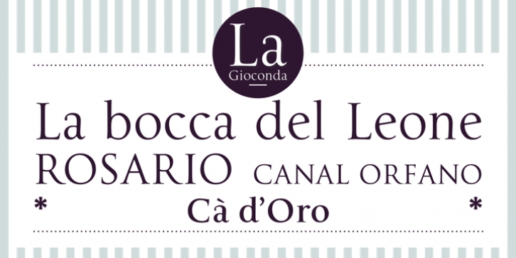
La Gioconda FONT Download


 Designer:
 Dave Farey,
Publisher: Letraset
The style of the Renaissance lettering master Giovanni Francesco Cresci is classical and timeless. Among a number of Italian scribes and lettering instructors of the period, he was the first to combine the elegance and proportions of the Trajan Roman capitals, and interpret a humanistic solution for a lowercase - his ‘Lettera antica tonda’, as illustrated in two of his work books, ‘Essemplare di piv sorti lettere’ of 1560, and ‘Il perfetto scrittore’ of 1570.
Cresci’s exemplary letterforms were the direct influence for Richard Dawson and Dave Farey in the creation of
La Gioconda, a type design which extends the usual Roman capitals with a lowercase, correctly structured small capitals and an additional set of non aligning numerals in two weights, Roman and Bold.The applications for
La Gioconda as a text and display Roman are surprisingly extensive, and visually rewarding. Designers of book jackets, magazines, packaging and point of sale will not have to search for a complementary roman text to accompany these beautiful Roman capitals, as
La Gioconda provides for both. The lowercase and small capitals supply an additional bonus for the adventurous designer, as they match exactly in height and weight in both styles, so mixing and matching can selectively eliminate ascenders and descenders if that is your choice, and the project requires it.
La Gioconda is a classic revival that can extend typographic boundaries.
Renaissance artists such as Leonardo da Vinci and Jacometto Veneziano painted portraits for patrons that were not only works of art, but robust portable possessions, equivalent to family snapshots. These were often provided with closing wooden covers, where a family motto or appropriate phrase would be painted on to the wood, with a crest or visual pun on the family name. If a portrait lacked a cover, then the back of the wooden frame would be used for the same purpose.


 The style of the Renaissance lettering master Giovanni Francesco Cresci is classical and timeless. Among a number of Italian scribes and lettering instructors of the period, he was the first to combine the elegance and proportions of the Trajan Roman capitals, and interpret a humanistic solution for a lowercase - his ‘Lettera antica tonda’, as illustrated in two of his work books, ‘Essemplare di piv sorti lettere’ of 1560, and ‘Il perfetto scrittore’ of 1570.
