«Back ·
Kentish AOE Pro FONT Download


 Designer:
 Brian J. Bonislawsky
Publisher: Astigmatic
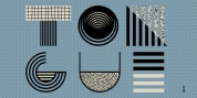
An elegant pairing of thick and thin sans-serif upright and italic types,
Kentish AOE Pro’s letterforms walk a line between deco style and vintage wood types.
Originating as a revival and elaboration of a limited lettering specimen from a series of old loose spanish specimen book pages. What began as just Capitals, Lowercase and Numerals was expanded to a rich pro glyphset including punctuation, small caps, small caps scaled figures, unlimited fractionals, superiors & inferiors, ordinals, tabular & proportional figures, and an expanded language glyph set.
From historical harkenings to modern letterpress, book covers, headlines, or anything else you want to give a dash of indescribable authenticity to,
Kentish AOE Pro is here to fill your need with Regular & Italic styles bundled together at a single price.