«Back ·
Ferox FONT Download
 Designer:
 Miles Newlyn
Publisher: newlyn.com
, but not bad to the bone. by Claudio Piccinini Demystifying the black letter negative identity, from Bastard to
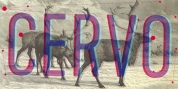
Ferox...
We’ve been always fascinated by the work of Miles Newlyn and there’s a thing that sets his work apart from the efforts of any other contemporary type designer, with maybe the only exception of Jonathan Barnbrook. We’re referring to the fact that, although many designers flirted once with the black letter style (we’re not talking of revivals, here), the latter has been present constantly in Newlyn’s research, revealing an authentic interest and fondness, not to mention a deeper knowledge of the subject than many designers of today have. The fantastic exhibition and publication 'Blackletter: Type and National Identity', conceived and developed between 1997 and 1998 by Paul Shaw and Peter Bain has provided finally a historically informed evaluation without prejudices over the many categories of the blackletter, a style, that, we must not forget, has been the first to be mechanized for printing in Gutenberg’s 42 line bible.
1) The desire of talking with you about the blackletter and of your latest
Ferox typeface in particular, fostered from a statement you made we find really objective. You wrote “For many of us, the blackletter type style has become synonymous either with evil by historical association, and second generation consumer design; sections of the music industry for example, or with quaintness of the Christmas card type. Clearly a typeface can’t possess any political or moral attribute by itself, it is in context that these perceptions arise, and so the associations we make with letter forms are flexible, changing with time and society”. Do you think, despite the lack of their commercial success, there’s still hope for the updating and reprise of the blackletter?
Blackletter was indeed captured by the pirates of darkness, and I very much doubt that we’ll ever see it on the side of light again. It tried to take it out of the shadows with
Ferox, but because of black letter’s continuing usage precisely for its negative associations, it will continually accumulate dark vibes. Black letter is a repository for evil associations, in much the same way that society vilifies many things, Afghanistan for example. Perhaps (and I hope not) the west will begin the same process with Kufic and other Arabic styles. It IS possible.
2) Steven Heller, the famous and controversial design critic, has written many articles and a book on the associations between the swastika and the black letter with the Third Reich and Nazism, saying that the swastika is “a symbol beyond redemption” (despite his original use) and–in his article “Designing Hate” (1) he stated that “anything set in Fraktur, even the most harmless words and phrases, takes on an decidedly ominous look”. It may be true, but we ask: why forever?
Perhaps answered above, I suppose that to reverse or ‘reprise’ the now ominous forms, Designers will have to use black letter typefaces in ‘upbeat, positive, friendly’ applications. This seems difficult to imagine, and goes against the process by which designers use form. I haven’t read the Steven Heller article, but I don’t think anything is really beyond redemption, and that I suppose has influenced how I design. Many designers allow certain forms to become untouchable, and draw clear lines between what is part of their palette and what is not. For example I know designers that will only use san-serif faces, and designers that will only use a handful of san-serif faces. This is the same to me as disallowing oneself to use pink or blue, though it maybe the same as someone saying they only like R&B music. Personally I like to think that I’m fairly broad-minded and my palette reflects that. Therefore, it will take a very large number of broad-minded designers to redeem black letter, and I don’t see that happening soon. The exception that disproves the rule is Austria, where one can see many styles of black letter used on fire stations to chemists without such associations. Re-phrase the question from ‘forever?’ to ‘everywhere?’ and the answer will be different.
3) The first digital design taking a fresh approach (albeit based on a historical Albrecht Dürer experimentation) to the black letter has been Bastard, by Jon Barnbrook. Although, as the name implied, the typeface obviously criticized nazism (and neo-nazism stupidity and hate), it did so using its same weapons and the name of the face was also intrinsically ironic. Do you think this may be seen as a start to recover the value of the beautiful black letter styles in a contemporary setting?
I don’t think that Bastard is a criticism of Nazism or Neo-nazism. Jon, I expect, is interested in black letter for the same reasons as I am, and that’s a fascination with a group of forms that have undeniable power, authority, and heart felt effect. As designers, we all utilize this language of forms; we depend on it to be able to guide users to the associations we want them to make. It’s not surprising that that so little is said specifically about this language of form, since design critics and journalists are so scared of ‘taste’. Taste and form are very closely related, it’s difficult to talk about form without making value judgments; this shape is more beautiful than that shape. It is presently unfashionable to talk about taste in an era of multi-cultralism and diversity, as if taste were their enemy and not their doorway. I can’t think of any design critic or journalist that can talk about form (and taste for that matter) with the clarity and judgment that Clement Greenberg did for the art world. Since I am very interested in car design, I’d hoped to discover another language to describe form within this industry, but I found it to be a lot more obvious, and I suppose less precise than I’d hoped (consisting mainly or positive and negative volumes). The fact that we decline or find it difficult to talk about form per se protects the designer’s skills in some way. It’s a bit like if you have to say something is cool, then it’s not.
4) Talking about
Ferox you said that you were ‘still in Oz Cooper shoes’ and this sounded to us particularly significant, since if we have to think of a ‘type feeling’ contrasting with the hard-edged-ness usually associated with black letter, our mind would surely go to the good-hearted, funny, optimistical and “chocolaty” forms of Cooper Black. Has Oz Cooper’s spirit been a good guide in your reprisal of the black letter through the design of
Ferox?
Well, you had a go at talking about form there, and it shows how difficult it is. The best way is often to quote similarities with other designers work. Writing about form has been out of fashion now for too long, issues like context, business, social and cultural aspects have begun to obscure the designer’s skills core skills, which I believe is still Taste. However, I’ve never started out on a project with the intention to create something tasteful. I approach a project with the intention of growing, broadening and refining my taste. Cooper Black was an influence on the terminals of the letters, though not in any other aspects. The major influence on the design though was technology, the tool, since all the curves are constructed from ellipses, a very easy shape to make on the computer. I was again pursuing my interest in the synthesis of historical form and computer aesthetics.
5) We like to see
Ferox as a beautiful and courageous step towards the reprise of black letter today and we hope to see more designers acquiring interest in it and in exploring and studying a rich and culturally important patrimony that could be sadly dismissed and relegated because of the nazis blindness. Unluckily you told us
Ferox wasn’t selling at all. We know that true experimentations hardly sell well, but they often prepare the path for work to come. What can you tell us, also about your Émigré release Sabbath Black?
I like black letter, and I’m interested in it’s rhythm, colour and dynamics, but it’s not my intention to reprise it. I wouldn’t dream of using it on a corporate identity, even though I think I could make the case for it. It’s a novelty type form, as most of my other earlier typefaces are novelty fonts too. The thing is I love novelty, and so do most people. There’s something uniquely human about liking odd, unique, personal, sentimental things. The reason why
Ferox hasn’t sold is that I’m not actively selling it. The proliferation of small foundries selling typefaces of varying quality has meant that designers today just don’t have the time to learn about typography and the typefaces available. For a foundry to be successful it has to do a lot of marketing, and I’m not prepared to get involved with that yet. I hope to release
Ferox through a large foundry soon. Sabbath Black is based on the ‘Old English’ plastic lettering stencil by Linex. So it’s really just the black letter companion to Template Gothic. I never intended to release it but Anne Burdick saw it and asked me for a beta version to use in an issue of Émigré that she was guest editing. That’s how Rudy and Zuzanna got to see it and that’s how it got into the Émigré library.
5) Another very interesting and demystifying typeface based on the black letter is the great Auferstehung, designed by , from the Linotype library, based on the very first typeface of all time, the aforementioned 42 line Bible type by Johannes Gutenberg. It spans over all type history. What do you think about it?
I would like to use it sometime, but I’m not sure what for, I’d love to see it carved in to the wooden beams of a neo-medieval pub, spelling out a slogan about how good it is to drink microbrewery beer.
6) We wish you to sell more of your great typefaces. On our part, we will always sustain your work! Thank you for the talk, Miles.
It’s great to talk with someone so interested.
(1) from the AIGA Journal 12, no.2, 1994. The article has been also reprinted in the excellent book ‘Texts on Type’ edited by Heller and Philip B. Meggs and published by Allworth Press, 2001