«Back ·
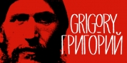
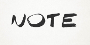
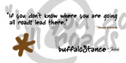
Cutoff Pro FONT Download


 Designer:
 Fulvio Bisca
Publisher: URW++
The first plain weight of Cutoff was designed in 2005 to be used in Miele, an independent Italian free magazine. The need was for an elegant, unusual and legible semi-serif with contemporary flavour. I was fascinated by the deconstructivist work of Jeff Keedy (Hard Times Thick), Phil Baines (Can You, You Can) and Otl Aicher (Rotis), so my aim was to get the feeling of a cut transitional typeface; at the same time felt the exigence to work on the whole shape of the glyphs, in order to soften the “90s deconstructivist” effect and obtain a more balanced and readable design.
In the last years I further worked on the typeface adding the other styles, extending the character set and refining the letterforms. Finally the precious collaboration with URW++ brought in 2010 to a complete OpenType Pro font family, with multilingual and advanced typographic features.
Fulvio Bisca, July 2010