«Back ·
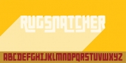
Conto Compressed FONT Download


 Designer:
 Nils Thomsen
Publisher: Nils Types
is a further member of the Conto Super Family, which contains 64 Fonts in total.
Other Members are Conto, Conto Condensed and Conto Narrow … Download: Conto PDF Specimen !!!
Conto is a clear and reduced sans serif typeface in eight weights (upright, italic). It is mainly designed for corporate identity along with the editorial design and advertising. A special set of ligatures make the fonts very useful for logo type and lettering.
The elegant Thin and the strong Black weights are working well in display typography, while the Regular, Medium and Bold weights are meant to stay well in text and tables.
Main characteristic are the minimalistic and reduced lowercase shapes (a/b/d/g/m/n/p/q/r/u). Another specific feature is the rising contrast. Whereas you can not find any contrast in the Thin weight, you will find more and more contrast while climbing up to Black.
Conto’s special ligatures are made for logo-types and lettering. Therefore you find Discretionary Ligatures like ‘r_a,’ ‘e_i,’ ‘s_t_u’ or ‘r_i’ and many more!!! Try the OT-feature ss01. Maybe there is something nice for your next logo.
Conto contains around 880 glyphs and supports all latin-script based languages. It also includes small-caps and all kind of figures you need for serious typography. Of course you have case and small-cap sensitive punctuation and fractions up to 1/9 (oneninth).
Nils Thomsen started to draw Conto in 2008. It is inspired by the lonely streets of north scandinavia and the dark forrest around. While cycling through the nature and drinking water from rivers the idea of a simple geometric typeface was born.
In remembrance of Peter Bruhn! Actually Conto should be published at the fountain foundry. During my studies in The Hague I interviewed Peter. The interview is collected in the book 158 answers. Towards this we had a nice exchange about my typeface. After some corrections he decided to release Conto. Thanks you for your help, Peter !!!