«Back ·
Bunday Clean FONT Download


 Designer:
 Ralf Sander,
Publisher: Buntype
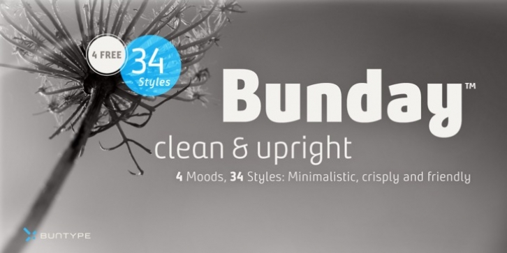
Bunday™ Clean is a minimalistic and friendly font family with different moods. It drops all „unnecessaries" like spurs and ears and it appears crisp and contemporary with a little squarish touch. Like the other members of the Bunday™ superfamily, Bunday™ Sans and Bunday™ Slab. Bunday™ Clean provides a second set of styles with characters, that refer to handwritten forms: the „uprights". These curvy styles give words a distinct look and a great appeal especially in display applications and logotype design.
Bunday™ Clean is space-saving and creates a homogeneous text color with good legibility. The font was manually hinted and contains extensive handcrafted kerning tables to ensure perfect appearance in all media.
It ships with 9 standard, 9 upright and corresponding italic styles from a considerable thin "Hair" to a pretty fat "Heavy" weight. It supports at least 99 languages and provides OpenType® features for ligatures, alternative glyphs, localized forms and many more.
Feature Summary*:
-4 Moods: Normal, Upright, Italic and Upright Italic
-9 weights: Hair, Light, Thin, SemiLight, Regular, SemiBold, Bold, ExtraBold and Heavy
-Supports at least 99 Languages incl. eastern european
-Overall width: Narrow or Space-Saving
-Advanced f- ligature set including fb
-Discretionary s- and c- ligatures
-Alternative Characters: a, e, f, g, l, t, y, A, E, F, L, and more
-Capital German Eszett
-Extra characters with Polish Kreska
-Catalan Punt Volat
-More than 570 characters per font
* Some features may only be available in OpenType®-savvy applications
Usage notes:
Letter-spacing, word-spacing and kerning has been optimized for reading sizes in print applications. We have tried to find a good balance between legibility and harmonic grey level. For smaller sizes and screen usage, you should consider to increase it by 10-20 em.To optimize readability furthermore, you might use the replacement characters for e and l (less cute but the eye is more accustomed to these more conventional forms).
Please, take a look at the other Bunday superfamily members:
Bunday™ Sans
Bunday™ Slab


 Bunday™ Clean is a minimalistic and friendly font family with different moods. It drops all „unnecessaries" like spurs and ears and it appears crisp and contemporary with a little squarish touch. Like the other members of the Bunday™ superfamily, Bunday™ Sans and Bunday™ Slab. Bunday™ Clean provides a second set of styles with characters, that refer to handwritten forms: the „uprights". These curvy styles give words a distinct look and a great appeal especially in display applications and logotype design.

