«Back ·
Vida Pro FONT Download


 Designer:
 František Štorm
Publisher: Storm
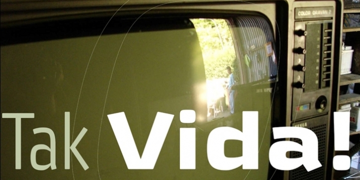
The new typeface family Vida was specifically designed for Czech Television in the framework of a competition for a new logo in summer 2006.
The drawing of each letter form differs finely in its logic, which is a feature invisible at first. It is constructed on a puristic base, but it doesn't reject the natural anomalies already known from ages of experience with latin alphabet. That’s why e. g. upper left section of ‘n’ is constructed differently from that of ‘r’, similarly as ‘d’ doesn't repeat right-bottom ending after ‘u’, ‘9’ is not inverted ‘6’. Such details improve reading in continuous text.
The behavior of all weights is consistent on CRT, plasma or LCD screens due to monolinear design; the lightest weight doesn't fade, the darkest isn't blurred, all is legible and clear in smallest sizes. Stem connections and endings were adjusted to avoid undesirable optical darkening.
The goal we desired was to achieve balance appearance in both electronic and printed form.


 The new typeface family Vida was specifically designed for Czech Television in the framework of a competition for a new logo in summer 2006.
