«Back ·
Seventies FONT Download


 Designer:
 Maximiliano Sproviero
Publisher: Lián Types
Meeeeoooow!
Seventies is another of my funkadelic attemps (1) to fill the existing gap of seventish looking fonts. In my opinion, that decade has a hidden treasure regarding type that remains unexplored: Only very few fonts rescue its groovy essence, its ‘colourful’ qualities.
But, don't have a cow man, and keep on truckin'! With
Seventies, my new foxy mama, your projects will stand out among the rest.
Since there’s not much information available about this kind of lettering I had to get ideas from other styles: Nowadays it’s easy to find all kind of books or guides to understand and practice how different styles of calligraphy and lettering should be done. However, for some reason, 60s and 70s letters seemed to ignore/be free of rules... Was this suggesting the birth of postmodernism?
I incorporated some ideas of the copperplate style of calligraphy: The ductus of its forms may be compared to the way letters are made in snell/engrosser’s script. Obviously, this is just the idea behind; the delicacy of thins is replaced here with the graceful imprint of really thick thicks with a brushy look and tons of good vibe.
Seventies will work awesome in posters, brands, magazines, book-covers of any kind, due to its modern look adapted to our century.
Well, catch you on the flip~side!
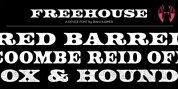
STYLES
To make you more psyched,
Seventies is a layered font! See examples in the posters using
Seventies Shade,
Seventies Shine and
Seventies Printed.
NOTES
(1) My first one was with Beatle in 2014.