«Back ·
Seuchter Experimental FONT Download


 Designer:
 Bruno Seuchter
Publisher: HiH
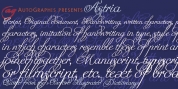
is a product of the fertile Jugendstil period in Austria. Drawn by Bruno Seuchter, about whom little biographical information is available, the design first appeared in Seuchter’s publication, Die Fläche, in 1902. Die Fläche means “surface or expanse,” presumably a reference to a “tabula rasa” or clean slate. The implication is one of starting anew, rejecting the past and searching for fresh, different modes of visual expression — which is exactly what Art Nouveau attempted to do.
Seuchter Experimental is a quirky and light-hearted font. Ligatures include AT, AV, CH, CK, FJ, LO and ST. Although basically an all-cap font, several of the accented letters in the lower case position represent the oft-seen desire to keep the accents below cap-height. The a-umlaut at 228 and u-umlaut at 252 reflect Seuchter’s original design. For a discussion of the difference between a diaresis and an umlaut, see Appendix B of Bringhurst’s The Elements of Typographical Style. In the meantime, give this font room to breathe.