«Back ·
Remora Corp FONT Download


 Designer:
 Nick Cooke
Publisher: G-Type
Remora is an extensive new humanist sans serif which comes in 2 style variations, the effervescent Remora Sans and its corporate business partner
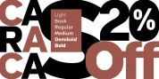
Remora Corp. Both styles include 5 individual width sets ranging from the condensed W1 to the extra-wide W5.
Furthermore, with an impressive 7 weights (Thin to Ultra) and true matching italics in each pack Remora is an ultra versatile super family comprising 140 individual fonts, perfect for any typographic assignment or design brief.
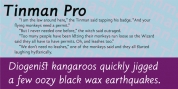
Remora was designed by G-Type founder Nick Cooke. Both the Sans and Corp families share the same proportions, with the exception of certain key characters that change the overall appearance.
Remora Sans is an exuberant and characterful typeface while
Remora Corp, as its name suggests, is a businesslike typeface more suited to corporate typography.
Quite early on in the design process Nick decided to give
Remora Corp equal billing instead of incorporating these glyphs as alternates or a stylistic set that may get overlooked.
"I created two separate families after learning a valuable lesson with one of my earlier typefaces, Houschka", says Nick. "Houschka contained distinctive rounded A's W's and w's, with ‘straight' styles as character alternates. Even though style sets and alternates are easy to activate they are rarely used, so after many requests for customised versions of the fonts with the straight characters as defaults it was decided to create the separate ‘Alt' family. So I cut straight to the chase with the two Remora variants and created two complementary families."
Both sets contain many shared letterforms, but it is the alternate characters that significantly alter the appearance of each font.
Remora has been carefully designed for optimum legibility at large and very small sizes. Although fairly monolinear in appearance, especially in the lighter weights, particular attention has been paid to optical correction like the overshoots of the curved characters.
Open counters and painstaking attention to detail (e.g. weight contrast between horizontal and vertical strokes, junctions of shoulders and stems etc) all boost readability and make Remora a great choice across all media.
Remora Sans and Corp are ‘humanist' rather than ‘geometric' in style, meaning they're not strictly based on rectangles and circles, resulting in a warm and friendlier feel. The slightly 'super-elliptical' rounded forms create generously attractive curves.
Remora has very distinctive italics in that they are only inclined by 8 degrees, but are not just based on slanted uprights. The italic styles are very alluring when used for display at large sizes and the good news is they come bundled free with their respective uprights.
Each family also contains many OpenType features including proportional and tabular numbers, small caps, discretionary ligatures, plus five stylistic sets for ultra versatile typography.