«Back ·
Lily FONT Download


 Designer:
 Gareth Hague
Publisher: Alias
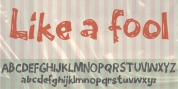
As with all our typefaces, we are searching for a point of difference, something that separates them from their surroundings. The idea of a seriffed script typeface is interesting, as the two are very separate ideas, certainly in calligraphic script lettering where serifs would interrupt the flow of writing. The typeface should retain a suggestion of having been written, or being possible to write. It should have a sense of formality, and as it was named after my daughter a beauty or specialness, but expressed in an original way.
The backwards incline immediately gave the typeface an unusual character shape and a modern spirit. The lower case characters have a thick and thin hairline stress, and how they connect is based on how these thick and thin line weights combine, not the mechanics of writing. This results in an odd top-heaviness in the lower case that gives
Lily a particularly unique character.
Lily has what you might call an occasional serif in its lower case, which again pays no relation to writing but echoes the weight and angle of the thin connecting line. It also adds an extra sense of movement and lightness. This sharpness can be seen in the loop of the g and y, which also maintain the same angle in the connecting line.