Tuesday, May 5
A Curated Gallery of Beautiful Fonts for Creative Designers
39,832 Premium Fonts


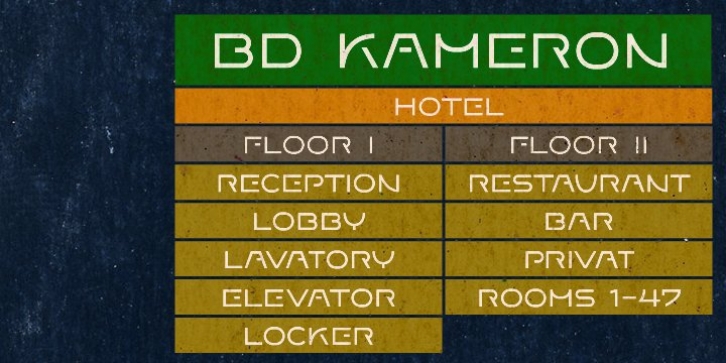
 BD Kameron has a pretty strange mix of Art Nouveau curves and modern corporate cleanness.
This font works well as an identity type of an entire guidance in a hotel or restaurant with a chic approach.
It could be the source for a new logo, as it could also the headline font in a magazine.
