«Back ·
Spencer FONT Download


 Designer:
 Sofie Beier
Publisher: Sofie Beier
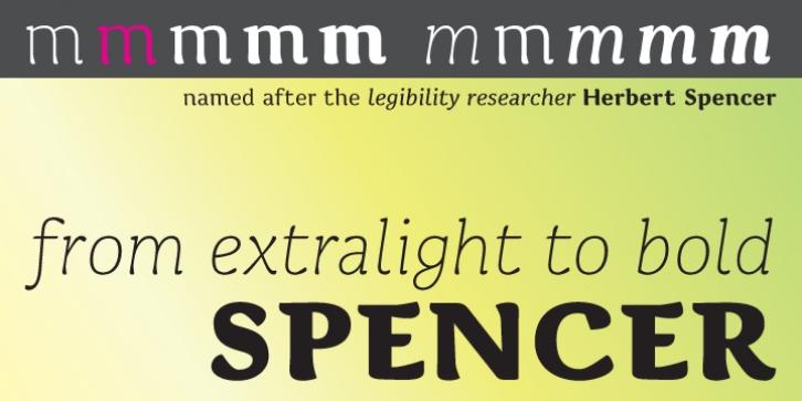
The typeface is named after Herbert
Spencer who ran a series of legibility studies at The Royal College of Art in the sixties and seventies.
An early version of
Spencer was subjected to experimental legibility investigations of distance and time threshold methods*. Participants were exposed to different variations of the most frequently misread lowercase letters within the typeface. The findings, demonstrated that the two-storey ‘a’ has a higher visibility than the one-storey ‘a’, that the upper part of the bowl of the two-storey ‘a’ should be round and not diagonal, that a long tail on ‘j’, ‘l’ and ‘t’ enhances visibility from a distance, and that the same goes for a serif on top of the stem of ‘i’. Yet, as pointed out by Walter Tracy in his book Letters of Credit, an extraordinarily wide lowercase ‘l’ could have a negative influence on the important word pattern. Nonetheless, one must assume that this only goes for situations in which another letter is placed to the right of the ‘l’, and not when the ‘l’ is the last letter of a word. The lowercase ‘l’ of the typeface
Spencer is therefore narrow when a character follows directly after, and broader when it is followed by a space.
In a legibility study of 1973, the researcher John Harris found that serifs on the lowercase counters appear to lower legibility. In the typeface
Spencer, serifs are therefore removed from the counters. To further enhance the differentiation of ‘b’ and ‘h’, the right stem of characters ‘h’, ‘n’, ‘m’ extend in an arc to the right, which ideally should enhance the horizontal flow of the font as well. To avoid the misreading of ‘D’ as ‘O’, the stroke of the bowl extends to the left of the stem in the upper part of the ‘D’. For harmony the feature is also applied to other uppercase characters with a horizontal upper stroke (B E F P R). The possible problem of misreadings between ‘R’ and ‘B'’ is accommodated for by an arc attached to the right of the leg of the ‘R’ – the arc is further applied to the other similar shaped characters: ‘A’, ‘K'’ and ‘k’.
* Beier, S. & Larson, K. (2010) ‘Design Improvements for Frequently Misrecognized Letters’, Information Design Journal, 18(2), 118-137


 The typeface is named after Herbert Spencer who ran a series of legibility studies at The Royal College of Art in the sixties and seventies.
