«Back ·
High FONT Download


 Designer:
 Gareth Hague
Publisher: Alias
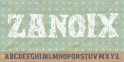
is defined by a set of simple ideas, or constraints. A non-geometric, humanist shape. A monoline weight. Stencilled, with a horizontal or vertical cut only, the stencil gap consistent - so positioned where that is possible.
High's letter shapes, which because of the stencilling are free of awkward connections at curve-to-vertical, have a fluidity and simplicity. By separating the letter elements, the stencilling makes the letters interesting, graphic shapes, making decorative words.
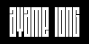
High has two options -
High Bar, which is a linear serif, and
High Ball - which has a circle-serif, like a ball terminal. The circle of
HighBall suggests Didone typefaces,
High Bar more utility, modern, slab serifs.
With
High Bar, the vertical serifs are consistently sized and unusually long. The shape repeats - the c has same-size serifs top and bottom, letters such as the f, j, r and y have slab serifs, the serifs and tittles of i and j the same size. These dash-serifs make a linear pattern, and has the feeling of a kind of a code.
The ball terminal of
High Ball gives a decorative effect - a series of floating, bouncing balls across words and text. The ball device is added top and bottom of the c, the g, j and y to ensure balance and rhythm across words and text. As with
High Bar, the repeating pattern give a codified look.