«Back ·
Escrow FONT Download
 Designer:
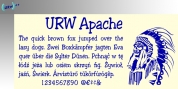
 Cyrus Highsmith
Publisher: Font Bureau
The Wall Street Journal commissioned
Escrow. Cyrus Highsmith designed 44 styles in this new Scotch series.
Escrow sets the tone of the front page of The Wall Street Journal, envy of the newspaper industry. “
Escrow is the spectacular element holding the whole thing together”—Design Director Joe Dizney. More austere than other Scotch versions,
Escrow adds striking new options to the designer’s palette.
Singling Out the Scotch
Joe Dizney and Mario Garcia, consultant for redesign, invited Font Bureau’s Cyrus Highsmith to review the current typography with them and suggest improvements to the headline structure. A complex mixture of styles were in use, a group that had accumulated through the paper’s long life. Monotype Scotch No.36 provided the heart of the paper’s well known image. Highsmith tightened and strengthened its structure by designing
Escrow, intensifying the familiar trademark appearance.
Expanding Monotype Scotch No. 36
At twenty-nine display and fifteen text designs, this new cutting of Scotch forms a large and growing series, disciplined, businesslike, and glowing with an austere life.
Adjusting Weight
The original Wilson Scotch from Edinburgh mixed a set of capitals from a heavy font with a lighter lowercase. Monotype copied the error into Scotch No. 36, one of several Scotch designs that The Wall Street Journal had accumulated over time. Highsmith corrects the error in
Escrow.
Copyfit
Highsmith maintains remarkably similar copyfit in the progression through the weights by adjusting counter width and serif length. Wordcount stays the same if set in all caps, and then follows a traditional gradient when using lowercase.
A “Newsier” Italic
Highsmith creates a certain formal dignity by reducing
Escrow italics’ slope from the original Monotype Scotch No. 361. Upon request for a “newsier” italic, flourishes are eliminated. A serif similar to roman ’n, r, i, u’ is adopted and a single story ‘g’ replaces the original’s awkward design. This formal solution also improves copyfit.
Display and Text Sizes
The fifteen
Escrow text fonts are intended for text set at twelve point and larger. They include small caps. Highsmith designed the text for The Wall Street Journal decks. The series makes a striking addition to the palette of the practicing graphic designer, useful wherever captions, subheads, and callouts should match headlines.
Among other uses,
Escrow is recommended for Newspaper, Magazine, Book and Corporate use.